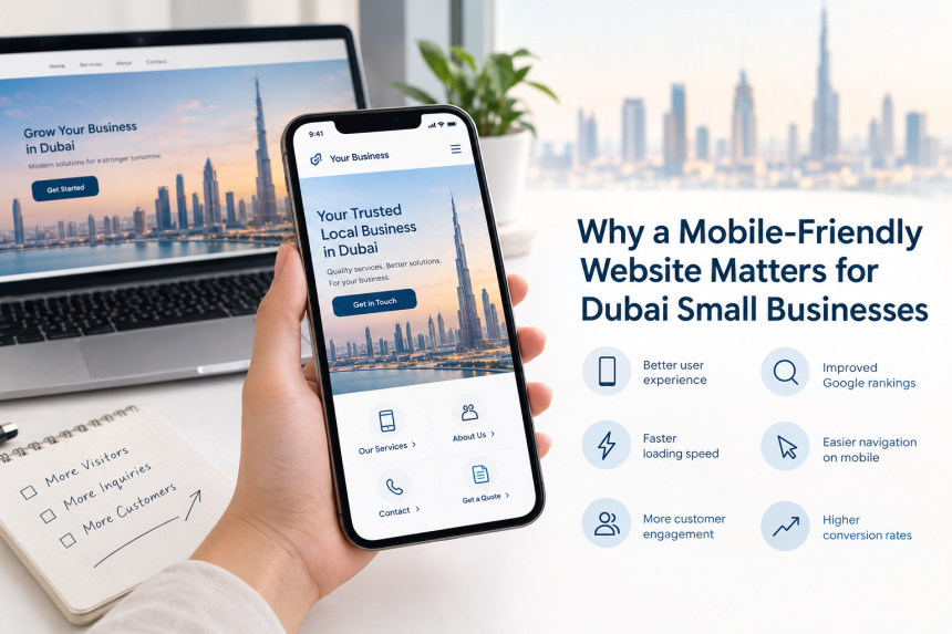
Small businesses in Dubai need a mobile-friendly website because most of the audience in the UAE use their smartphones to buy, browse, and contact local services. In today’s digital world, without a mobile-friendly website, you can lose a significant portion of your audience to competitors. When users find it difficult to navigate your website on mobile phones, they will eventually leave without exploring it further. Mobile-friendly design is essential for small businesses and should be considered from the start of design, not added later.
Why mobile-friendly design is essential for small businesses
The UAE’s digital market is highly connected through smartphones. That’s why small business web design in Dubai must be mobile-responsive to reach the maximum audience.
For example, a user searches “accounting firm in Dubai” on a smartphone. The site opens; the user checks for the services, searches for the phone number or WhatsApp contact, but can’t find it because it is buried at the bottom of the page. If the website requires excessive zooming, the menu is hard to open, and the enquiry button is difficult to find, the user has to make a lot of effort that will frustrate them. This small friction can affect small businesses a lot.
What is a mobile-friendly website
A mobile-friendly website is designed and developed with a strategy that makes it easier for the audience to use the site on smartphones and other smaller screen devices. It involves using responsive web design that allows the current website to adapt its layout and content according to the type and size of device being used. See our Responsive Web Design Guide for more information.
A mobile-friendly design helps your website with:
• Readable text without unnecessary zooming
• Images that fit smaller screens
• Simple mobile navigation
• Buttons large enough to tap comfortably
• Forms that work properly on touchscreens
• Click-to-call contact options where appropriate
• Fast-loading pages
• Clear calls to action
• Proper spacing between interactive elements
• Consistent branding across devices
What are the reasons that make mobile-friendly design essential for Dubai small businesses
Easier for customers to find and contact you
A local business website in Dubai must make the next step easier and understandable for users.
For example, a service business will follow it like this:
1. Call
2. WhatsApp
3. Request a quote
4. Book an appointment
Another example can be a restaurant:
1. View menu
2. Order
3. Reserve
4. Get directions
For mobile phone users, these actions must be completed easily without forcing the user to indulge in unnecessary frustration. Small businesses especially need this type of web design because they construct a website to help visitors take the next step beyond receiving useful information.
Mobile-friendly design supports Google search
Mobile design is ideal for SEO practices. Google chooses the mobile version of a website for indexing and ranking through mobile-first indexing. Google recommends mobile-friendly design and implements it. It doesn’t mean that ranking can be achieved through mobile-friendly design; there are many other factors that influence rankings. They can include page experience, content quality, technical accessibility, etc.
But mobile-friendly design is important because it enhances usability and avoids technical issues. For local small businesses in Dubai, mobile-responsive design is necessary for SEO foundations and overall web development.
Fast-loading pages make browsing easier
Mobile-friendly design and fast-loading speed support each other. A page can fit on a mobile screen but still function poorly because of large images, heavy animations, unnecessary scripts, or poorly optimised third-party tools. A fast-running page can’t solve website optimisation. The pages would still take time to load.
If you want your website to load fast and become high-performing, make sure to do the following:
• Compressing large images
• Using appropriately sized images
• Limiting unnecessary animations
• Reducing unused scripts
• Using caching where appropriate
• Choosing suitable hosting
• Testing pages on real mobile devices
• Monitoring Core Web Vitals and other performance metrics
The main purpose of developing a website is to provide useful information to users without making them wait to access it.
Mobile visitors expect simple navigation
As compared to desktop screens, mobile users have limited screen space to navigate the website. Small businesses need to consider this issue so that visitors don’t get frustrated to view a site on small screens. Mobile navigation should allow users to easily reach the important pages such as:
• Home
• About
• Services
• Products or Menu
• Locations
• Contact
According to the type of business, additional options can include Booking, Portfolio, Pricing, FAQs, or Online Ordering.
Local actions become easier
Local audiences might want to contact the company straight away rather than reading the whole company site. They might contact the business in the following ways:
• Call
• Send a WhatsApp message
• Find the address
• Get directions
• Request a quotation
• Book an appointment
• Check opening hours
• View a menu
• Submit an enquiry
These options must be designed after exploring which way users will opt.
For example, a dental clinic could place Book Appointment prominently near the top of the mobile page. A restaurant could prioritize View Menu and Order Online. That’s why you should prioritise mobile-oriented design, rather than squeezing the desktop version.
What features should a mobile-friendly website include
Website element What to check on mobile
Navigation Menu is easy to open and understand
Typography Text is readable without zooming.
Images Images fit the screen and load efficiently.
Buttons Buttons are easy to tap
Forms Fields are simple to complete
Contact details Phone, email, and relevant contact options are visible.
Location Address and directions are easy to find
Calls to action The next step is obvious.
Speed Pages load efficiently
Content Important information appears early.
Accessibility Content remains usable for people with different needs.
Language Arabic and English versions, where appropriate, are usable on mobile.
Businesses that serve both English- and Arabic-speaking audiences should pay attention to both versions’ layout, navigation, typography, and readability. Just converting the desktop version to a mobile screen without checking the presentation can cause severe performance and usability issues. These Web Design Tips can save you from big losses and waste of money.
Mobile-friendly design doesn’t mean focusing on mobile only
Most of the businesses understand it wrongly that developing a website just for mobile phones is not suitable. Users can search and browse your website from any type of device. The better approach is to use responsive design, as Google recommends it because a responsive site can easily adapt to any device type without changing the underlying URL and HTML. The website must be tested across the following devices:
• Smartphones
• Tablets
• Laptops
• Desktop monitors
This means the user experience is still smooth while the site adapts to the device’s screen. It is important for businesses to update their website regularly. It is easier to maintain one responsive website rather than managing multiple websites on mobiles and desktops.
Mobile design and accessibility
Mobile-friendly design collides with accessibility. You don’t need to craft a small business website just like a government portal. Just make sure that your website is easy to use, can be understood by as many people as possible, and can be accessed easily.
Practical ways include:
• Sufficient text contrast
• Descriptive link and button labels
• Keyboard accessibility where applicable
• Alternative text for meaningful images
• Clear form labels
• Logical heading structure
• Avoiding overly small text
• Avoiding interactions that depend entirely on precise gestures
For a high-performing website, accessibility should be considered from scratch rather than implemented afterwards.
What are the common mistakes businesses should avoid
• Designing for desktop first, then for mobile size.
• Using oversized images
• Hiding main information
• Making buttons small
• Overloading the homepage
• Adding too many animations
How I build mobile-friendly websites in Dubai
When planning a development or redesigning a small business website in Dubai, Saad Ashraf focuses on more than on screen responsiveness. He considers business objectives, target customers, content structure, mobile navigation, conversion actions, bilingual requirements where needed, page performance, and future SEO needs. the main purpose is to create a site that works well as a business tool rather look attractive on a phone.
How to test a small business website on mobile devices
Before deploying the mobile-friendly website, recheck it from a customer’s view who can use a mobile device. The process is mentioned below:
1. Open the website on multiple smartphones: check different mobile sizes instead of checking on just one device.
2. Complete the main customer journey: Try to find a service, product, price, location, phone number, or booking option.
3. Test all important buttons: Check phone links, WhatsApp links, forms, maps, menus, booking systems, and other calls to action.
4. Check forms: Submit enquiries using a smartphone. Ensure fields are easy to complete and the enquiry reaches the destination.
FAQS:
• Why is possessing a mobile-friendly website more essential in Dubai than in any other place?
It is because Dubai has a tech-oriented environment and more than half of the crowd uses mobile phones. Customers and tourists rely on mobile devices to search, book, and order food deliveries while on the go.
• Is a mobile-friendly website helpful for local SEO in Dubai?
Yes, it is great for SEO as Google prioritises the mobile version of the website for indexing. If your website works well on smartphones, it is likely to rank in local searches.
• What is the difference between a mobile-friendly website and a mobile app?
A mobile-friendly website can adapt flawlessly to any device screen without downloading, while a mobile app needs to be downloaded.
• How can a mobile-friendly design enhance my sales and enquiries?
Disturbing layout, difficult-to-read text, and slow speed can drive customers away. That’s why, when you possess a mobile-friendly website, these issues won’t get in the way of your sales and enquiries.
• Do I need a bilingual website for my Dubai business?
Yes, as Dubai is a diverse and multicultural city, having a bilingual website is an ideal option.
Conclusion
Dubai businesses need a mobile-friendly design so that customers can find the required information easily when they need it. The responsive and highly qualified small business web design in Dubai should not simply squeeze the desktop version into smaller screen sizes but should focus on mobile navigation, performance, content hierarchy, accessibility, local search, and customer actions from the beginning.