Ah, font pairings— the two-word expression to a web designer is thrilling, but likely not so much to an average Joe.
Either way, what is so significant about font pairings? Can’t you just select two fonts and call it a day for your website? Okay, you may, but in your best interest, it may not be.
Choosing well-balanced fonts will help your page flow nicely, look aesthetically pleasing, and make sure your website or graphic looks professional and readable.
Choosing any two fonts on a whim, however, or just because you like them all separately, doesn’t mean they work together well — and if they don’t work together well, your project may be suffering.
Dubai Web Designer looks at some of the best font pairings in this blog that work together to create a fantastic website design, social media templates, presentations, and more.
The importance of font-pairing:
Why are the fonts in your project so critical to look great together?
It’s easy. If fonts don’t jive, audiences find it hard to read the content quickly, and they may not read it at all when they struggle to read the content or feel overwhelmed by competing fonts.
Similar to the color scheme, selecting the right font pairings is a must to keep users engaged with your project.
Also, selecting a font that allows your heading to stand out so that users know exactly what they are reading is crucial. The heading is flexible in that you can use a font that’s a bit more off-the-wall than a font you’d choose to copy your body.
On the other hand, as it will be the bulk of your page, your body copy should use a font that is easy for users to read.
When all is said and done, one unified template should be created by the heading, the subtitle, and the body copy.
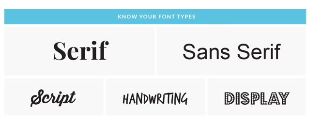
Different kind of fonts:
· Serif:
Serif fonts refer to the form at the end of each letter stroke that has small feet. The feet are also sometimes called embellishments.
· Sans Serif:
Sans serif means “without serif,” indicating that at the end of each stroke this style has no feet or embellishments.
· Script:
Script fonts are often called a more sophisticated type of font, and each letter connects to the next one.
· Decorative:
This style is reserved for signage and headlines but is rarely professional, the most diverse group of fonts.
Tips for choosing pleasing font pairing:
Here are some tips suggested by Freelance Web Designer Dubai to keep in mind when choosing fonts on a website that are similar to each other.
1) Think Contrasting:
You want to contrast the font styles that you choose, but not compete with each other. For example, on the same page, two types of decorative styles should compete with each other instead of contrasting.
Alternatively, in addition to the serif font, you can choose one decorative or script font.
The selection of a sans serif font and a serif font is another common complementary pairing.
One of the most important parts of the choice of complimentary, contrasting font pairs is to make sure the two fonts are not too similar. Select two fonts that are sufficiently different that viewers can tell.
2) A Big font-family:
The hard work of hierarchy and matching is essentially done for you when you find a font family that you like. This is great because you will know that these fonts are already working well together because they are part of the same family. All you have to do is choose how in your project you want to arrange them.
3) Consider kerning:
3) Consider kerning:
In a typed-out word, the space between letters is called kerning. Do not be afraid to play with the kerning of certain fonts. script letters to make a cool layout are intended to communicate with each other and create a sense of fluidity, fonts in script families would not fit well with kerning. Also, read Don’t make people think; just improve website usability.
But with kerning, an all-caps, sans serif font can look great.
Wrapping up!
Consumers can say with this hierarchy that data is the most important, the second most important, and finally the specifics without even reading a word of the material.
The development of hierarchy with your fonts is, therefore, an even better way to achieve a successful layout.
Let’s Get in Touch:
Hire me to help you get your font-pairing right.