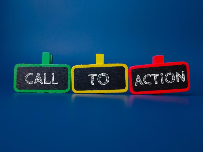
Websites exist to engage visitors and guide them toward meaningful actions. Every page should encourage users to move forward. A call to action directs visitors clearly, increasing the chance of positive interaction. Without CTAs, users often leave without exploring the services or making a purchase. CTAs transform interest into measurable results by leading users to the next step. In this blog, we explore strategies for designing and placing CTAs effectively. We also highlight common mistakes to avoid when using a call-to-action. You will learn how experts build compelling designs that drive conversions. A Web Designer Dubai often includes tested CTAs that ensure better engagement. This approach boosts leads and enhances user journeys. Read further to see how to apply these practices on your own site.
What Makes a CTA Effective for Websites
Visitors should instantly understand the purpose. The wording should be short yet powerful enough to inspire clicks. Effective CTAs often use urgency like “Sign Up Today” or “Get Started Now.” Buttons or links should stand out on every page. Placement is important because hidden call-to-actions fail to convert. Many businesses work with experts like Freelance Web Designer Dubai for better results. Professionals create call-to-action text and visuals that resonate with target audiences. They also test variations to improve performance. A strong call-to-action highlights the benefits users receive by clicking. For instance, “Download Free Guide” works better than “Submit.” Simplicity combined with value makes CTAs more successful.
Understanding User Psychology Behind CTAs
People act when they feel urgency, curiosity, or a sense of reward. Call-to-actions must connect with these triggers. Words like “exclusive,” “limited offer,” or “free trial” push faster responses. CTAs also work when they match the visitor’s intent. A reader browsing services will click “Learn More” faster than “Buy Now.” Visual appeal matters too. Colors attract attention and signal importance. Studies show red, green, or orange buttons often convert better. A skilled designer applies these principles thoughtfully. Trust also influences user actions. When users see reviews or security signs near call-to-actions, they feel safe. Businesses in web design Dubai apply psychology-driven call-to-actions to increase interactions. Understanding behavior ensures users engage naturally and without pressure.
Placement Strategies for CTAs on Your Website
Placement defines how effective CTAs perform. A button hidden at the bottom rarely attracts attention. Strategic positioning ensures users see call-to-actions without extra effort. Top banners work well for urgent campaigns or limited offers. Sidebars allow CTAs to remain visible as visitors scroll down. Call-to-actions inside blog posts can capture interest when readers feel engaged. End-of-page buttons are also effective since user’s finish consuming content. Pop-ups are another method, though they must not interrupt negatively. Mobile sites need simplified placements for smaller screens. Professional agencies often analyze visitor patterns before finalizing positions. They study where visitors click most frequently and place Call-to-actions accordingly. Positioning is not about random choices but about data and design working together. Website CTA Dubai strategies often use multiple placements to maximize effectiveness. Proper placement builds seamless user journeys and improves conversions significantly.
Crafting CTA Text That Inspires Action
Call-to-action wording should inspire immediate action. Strong verbs like “Join,” “Start,” or “Discover” create energy. Phrases must show benefit to the user, not just business goals. For example, “Save Money Today” converts better than “View Details.” Personalization also helps. Words like “Your” or “You” make CTAs relatable. Text length should remain short and focused. Visitors avoid clicking long or confusing buttons. Clarity removes doubt and increases trust. Creative wording still needs to match your brand voice. A casual tone may fit lifestyle brands, while a formal tone fits financial services. Testing multiple versions reveals which wording performs better. This approach ensures higher conversion rates. Mr. Saad, known as the best app developer, often advises businesses on crafting strong call-to-action. Clear, direct, and engaging text creates meaningful user responses.
The Role of Color and Design in CTA Success
Design plays a critical role in call-to-action performance. A button must stand out without clashing. Contrasting colors ensure users notice the CTA quickly. Yet, the color should align with the brand identity. Rounded buttons often feel friendlier, while sharp edges feel more professional. Font size and style must remain readable across devices. White space around CTAs improves visibility and avoids clutter. Icons can strengthen call-to-action appeal by adding visual context. Placement and design must complement each other. For example, a bold button near engaging text increases clicks. Designers also test different color combinations for maximum impact. Successful call-to-actions combine creativity with user-centered design principles. Mister Saad, respected as a best app developer, highlights the role of balanced design in user interactions.
Using CTA Buttons for Mobile-Friendly Experiences
Mobile users browse differently than desktop users. Call-to-action buttons must adapt to smaller screens. Buttons should be large enough for easy tapping. Placement must consider thumb reach zones for comfort. Call-to-action should appear quickly without excessive scrolling. Text must remain short since mobile screens limit space. Colors should remain visible under different lighting conditions. Mobile responsiveness ensures CTAs work across all devices. Companies focusing on increase conversion Dubai often emphasize mobile optimization. This ensures businesses capture users who browse primarily on phones. A smooth mobile experience keeps visitors engaged. Responsive design ensures users act without frustration. Mobile-friendly call-to-actions increase overall traffic and lead quality. Ignoring mobile usability results in missed opportunities and lower engagement.
How CTAs Influence Sales and Lead Generation
CTAs connect curiosity with conversion. Without CTAs, visitors often leave without action. A simple “Buy Now” button can lead directly to sales. “Sign Up” buttons collect valuable email leads. They encourage visitors to connect deeper with your brand. They drive measurable outcomes like purchases, downloads, or subscriptions. Clear CTAs guide users smoothly toward business goals. In sales-focused websites, they play the role of digital salespeople. Lead generation also benefits greatly from effective CTAs.
Common Mistakes to Avoid with CTAs
Many businesses make errors with CTAs. Overloading a page with too many CTAs confuses users. Weak wording like “Click Here” fails to inspire. Poor color contrast makes CTAs invisible. Long forms linked to CTAs discourage conversions. Ignoring mobile optimization leads to lower performance. Businesses must also avoid vague or misleading promises. Broken links harm trust and reduce credibility. Placement matters, so hiding Call-to-actions in footers limits visibility. Not testing variations reduces learning opportunities. Clear, well-placed, and honest Call-to-actions improve user trust. Avoiding these mistakes creates smoother user journeys and better results.
Benefits of Strong CTAs for Business Websites
Strong CTAs deliver measurable benefits. They increase conversions and engagement. Clear guidance keeps visitors connected with your services. Businesses enjoy better sales and stronger lead pipelines. Professional call-to-actions provide both clarity and value. They allow businesses to compete effectively online. Strong Call-to-actions create trust and highlight brand professionalism. Results include better ROI and stronger digital presence.
Final Thoughts
CTAs are essential for turning visitors into customers. A call-to-action guides users clearly toward next steps. Strong CTAs combine design, psychology, and strategic placement. Businesses gain higher leads, stronger branding, and consistent sales. Professionals ensure CTAs remain optimized for all devices.
FAQs
1. What is a CTA on a website?
A Call-to-action is a button or link that guides users toward actions.
2. How do CTAs improve conversions?
Call-to-actions direct visitors clearly, reducing confusion and inspiring faster decisions.
3. Where should I place CTAs?
Call-to-actions perform best in visible areas like headers, content sections, and end-of-page.
4. What is the difference between weak and strong CTAs?
Strong Call-to-actions are clear, urgent, and benefit-driven.