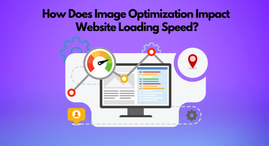
Image optimization improves website loading speed by reducing the file size of images without compromising quality. This results in faster page loading times, which enhances user experience and boosts SEO rankings. Optimized images consume less bandwidth and reduce the strain on servers, improving overall website performance
Website speed is not a luxury in the digital world. With the need for access to content in real-time, every second is valuable. Unoptimized images are one of the largest (but the most readily-ignored) purchasers of slow sites. High-resolution, improperly formatted, and oversized media can drag down even the most creative and well-designed websites.
This issue is not only limited to loading time but also to the direct effect it has on the perception of the user towards your brand and the duration they spend on your site, as well as the rank of your pages in the search engines. How, then, does this optimization of images fit into this wider picture of web performance? And more importantly, how can you take advantage of it to build a high-performing site?
Quite a good way to get the answer would be to figure out what image optimization is all about and how it serves as an enabler to all the other things a web developer has to do nowadays. Read further:
1. What Is Image Optimization, and Why is it the Core of Web Performance?
Image optimization can be defined as the practice of minimizing the size of an image without distorting its visual images. It is about the correct format selection, file compression, screen dimension adjustment, and such modern delivery approaches as lazy loading and content delivery networks (CDNs).
This foundational practice is the first step toward a productive digital experience. Its absence can render even the most excellent content and functionalities useless because no one will stick around and wait until your site loads.
2. The Role of Responsive Images in a Seamless Digital Experience
Optimized images are not sufficient when they are not approachable. This is where receptive image design comes into play. It ensures that every image that is being sent to the user fits into the screen size, device resolution, and bandwidth. By using HTML attributes, such as srcset and <picture>, qualified developers are able to generate image collections that adapt to a variety of screens, and therefore, a user of a smartphone does not have to load a 4K desktop-sized image.
3. Website Developers:
An experienced and Registered website developer understands that every kilobyte counts. Image optimization is an aspect developers include throughout the codebase and overall performance strategy through to deployment.
The Certified developers minimize the payloads of images by WebP conversion, automated build systems, and CDNs. They also have lazy loading and caching policies that keep loading at a minimum.
In highly competitive markets like Dubai, being a skilled Web Developer Dubai means more than writing clean code—it means building digital products that are optimized, scalable, and dependable from day one. And no developer can work in isolation. In order to actually make the sites that are visually impressive and load fast, it is essential to work together with designers.
4. Partnership with Web Designers in terms of Leveled Performance and Appearance
A good-looking design loses its impact when it takes too long to load on the screen. That’s why developers and designers especially an expert Web Designer must work closely together. Designers select the image based on the brand identity, choosing the correct format, size, and styling to ensure fast performance and visual appeal. And they must also pay attention to technical limits: Is this hero image going to slow up the site? Does this PNG have to be this way, or instead an SVG will do?
Through early cooperation with developers, the Licenced designers will be able to make sets that are appealing to the eye but ready to run.
5. Constant Maintenance and development
The task does not finish When a site is published; uninterrupted care and monitoring of performance are necessary. This includes:
- Modernization of obsolete image formats
- Compression of new uploads
- Determining slow pages in analytics
- Selling extraneous resources in old posts of blogs or items in stock
An engaging site is flexible to new devices, sizes of screens, and content formats. However, even the best-optimized websites might require redevelopment to remain at the upper level of performance, in particular, when new features or branding elements appear.
Such continuous development makes the site professional and competitive- particularly for businesses that deal in high-valued services via the Internet.
6. Format of images
Not every format of the image is equal. The type of file used may greatly vary the quality and performance by means of selection. There are different types of image formats, and smart optimization includes comprehending them.
- JPEG: It is perfect when the photograph contains a lot of colors. It has a quality against file size that is good.
- PNG: Used when it comes to images and logos, but bigger and less transparent.
- SVG: Ideal to show icons and graphics. They scale and do not lose quality, and they are also small in size.
- WebP/AVIF: Newer formats with better compression without loss of quality. Compatible with the majority of the current browsers.
The application of the incorrect format may skyrocket the loading time. An example is to upload a sizeable PNG when a compressed JPEG is done.
This leads us to the increasing rates of demand for fast-loading content within smartphones and tablets- on which optimization is even more essential.
7. Mobile Optimization:
Over 50 percent of any web traffic is due to mobile. When your site is not optimized for mobile, you are alienating a huge segment of your audience. Image optimization here is a factor in the responsive mobile experience.
Large images not only slow the site on mobile networks but also will cost a user their data plan and the further likelihood of them abandoning the site. Adaptive image delivery, CSS media queries, and compressing your images to mobile resolution can ensure that your site will be effective on all platforms.
Mobile optimization is not a task of developers only; it affects the general UX/UI design, content strategy, or even hosting settings. It also quantitively affects user satisfaction, which is translated straight into the business value.
8. Conclusion:
To respond to the question of how the optimization of images influences the speed of loading a website, we must realize that it is not a treatment that can be isolated; it is an aspect of a multi-factor solution to web development. As soon as a designer chooses a layout, optimized images will help to provide a faster, smoother, and more stable experience to the User experience design. The team of specialists and experts delivers customised web design solutions tailored to meet your brand’s unique goals and identity.
FAQs
1. What does image optimization do to impact the speed of a website?
Optimization of images also helps to decrease the file size of visual materials drastically without affecting the quality. It results in reduced loading times, enhanced responsiveness, and a more efficient, high-performing web experience.
2. Which kind of image optimization techniques work best?
Some of the ordinary optimization methods are the compression of the images, the proper selection of the image type (JPEG, PNG, SVG, WebP), resizing to become responsive, the execution of image lazy loading, and Content Delivery Networks (CDNs). These compromises are between quality and speed when dealing with any content.
3. What is the impact of optimization on images of SEO?
Optimized images also improve Core Web Vitals such as Largest Contentful Paint (LCP), which is a direct ranking factor by Google. Search engines prefer faster-loading pages and help build positive visibility and user engagement and reduce bounce rates.
4. Will mobile performance be better with image optimization?
Yes. Optimizing it with mobile uses the weight of images. Through serving device-specific image sizes and the application of compression, the websites would load quicker on smartphones and tablets by decreasing data consumption and enhancing the general experience of a site.