Website navigation shapes how users explore content and make decisions. Many visitors leave websites due to confusion. Poor navigation causes frustration and trust loss. In this blog, we explain why website navigation feels confusing and how professionals fix it. Clear navigation improves engagement, time spent, and conversions. Businesses in Dubai face high competition and user expectations. Visitors want clarity, speed, and ease. Navigation problems often come from poor planning and design choices. Small UX mistakes create big usability issues. Understanding these problems helps businesses grow online. This blog also reflects real user behavior patterns. It supports better digital decision-making. Many companies consult experts like SaadAshraf for usability clarity. Let us explore the most common navigation mistakes and how experts resolve them effectively.
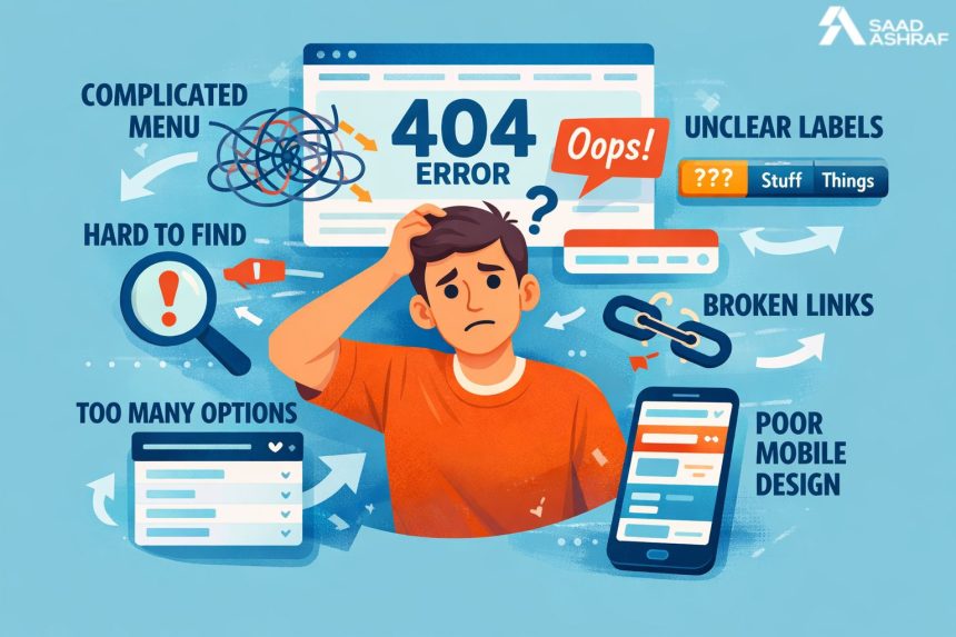
Poor Information Hierarchy
An information hierarchy guides users through a website. Poor hierarchy confuses visitors instantly. Users struggle to find important pages. Content appears scattered without priority. Important links hide behind less relevant items. Clear structure helps users scan pages. Designers organize content based on user intent. Logical grouping improves clarity and flow. Visual hierarchy supports better understanding. Headings, spacing, and alignment matter greatly. Websites must guide users naturally. Without structure, users feel lost. Proper hierarchy improves usability and trust. Strong planning prevents this common mistake.
Overloaded Menus Create Confusion
Menus often become cluttered with too many options. Users feel overwhelmed by excessive choices. Long menus increase decision fatigue. Visitors hesitate and exit the site. Simpler menus improve focus and navigation. Experts apply menu structure improvements UAE strategies for clarity. Grouping items reduces cognitive load. Dropdowns should stay clean and meaningful. Clear labels help users decide faster. Menus must match user goals. Reducing clutter improves interaction and satisfaction. Clean menus support better user journeys.
Inconsistent Navigation Patterns
Consistency builds familiarity and confidence. Inconsistent navigation disrupts user flow. Links change position across pages. Labels vary without reason. Icons lack clarity or meaning. Users feel unsure about actions. Consistent patterns improve learning and memory. Navigation should behave the same everywhere. Buttons and menus must remain predictable. Visual consistency enhances trust. Designers follow established usability standards. Consistency reduces confusion and errors. Users appreciate stable experiences.
Mobile Navigation Issues
Mobile users expect quick access. Poor mobile navigation frustrates users instantly. Small buttons reduce usability. Menus hide important links. Touch targets feel cramped. Designers must adapt navigation for screens. Responsive layouts improve accessibility. Clear icons support mobile browsing. Mobile testing ensures proper interaction. Navigation should remain simple and intuitive. Mobile-friendly design increases engagement. Ignoring mobile needs harms user retention.
Lack of User Focus
Many websites focus solely on business goals. They ignore user expectations. Navigation should serve user intent first. Designers study user behavior patterns. Research helps predict user needs. Clear paths support goal completion. User-centered design improves satisfaction. Websites must answer user questions quickly. Navigation guides users toward solutions. Focusing on users increases conversions. UX driven planning avoids confusion.
Missing Visual Cues
Visual cues guide users silently. Without cues, users feel lost. Buttons should look clickable. Active links need distinction. Icons should reflect the function clearly. Color contrast improves visibility. Spacing directs attention effectively. Visual signals support navigation decisions. Designers use cues to reduce effort. Clear cues improve accessibility. Small details make big usability differences. Good design communicates without words.
Poor Labeling Choices
Labels define navigation clarity. Vague labels confuse users. Technical terms reduce understanding. Users prefer simple language. Clear labels improve findability. Each label should describe its destination. Designers test labels for clarity. Familiar terms build trust. Good labels reduce navigation time. Misleading labels frustrate users. Clear naming improves user flow. Language should match user expectations.
Ignoring Search Functionality
Search supports quick navigation. Many users rely on search bars. Missing search limits accessibility. Poor search design frustrates visitors. Search should remain visible and functional. Autocomplete improves user experience. Filters refine results effectively. Search supports large content websites. Designers optimize search for usability. Efficient search reduces bounce rates. It supports goal-oriented users.
Slow Loading Navigation Elements
Speed affects navigation experience. Slow menus annoy users. Heavy scripts delay interactions. Users expect instant responses. Designers optimize code for speed. Lightweight elements load faster. Performance testing ensures smooth navigation. Fast websites improve satisfaction. Speed builds trust and retention. Navigation must respond instantly. Slow responses increase abandonment.
Accessibility Barriers
Accessible navigation serves all users. Poor accessibility excludes many visitors. Keyboard navigation should work smoothly. Screen readers need clear labels. Color contrast supports visibility. Designers follow accessibility guidelines. Inclusive design improves reach. Accessibility enhances usability for everyone. Navigation should support diverse abilities. Compliance builds trust and credibility. Accessible sites perform better overall.
UX Testing Gaps
Testing reveals real user issues. Skipping testing causes hidden problems. Assumptions replace actual feedback. Designers conduct usability tests regularly. Testing improves navigation clarity. User feedback guides improvements. Iterative testing refines experiences. Real data prevents confusion. Testing validates design decisions. Continuous improvement ensures better usability. Testing saves long-term costs.
Local User Behavior Differences
Regional behavior affects navigation needs. Dubai users have unique expectations. Cultural preferences influence browsing patterns. Language direction matters in design. Designers study local behavior. Geo-specific insights improve usability. Local optimization boosts engagement. Navigation must reflect audience habits. Understanding users improves outcomes. Localization supports better experiences.
Professional UX Fixes That Work
Professionals apply proven UX methods. Experts analyze user journeys carefully. They simplify navigation paths. Designers remove unnecessary steps. Testing confirms improvements. Clear design improves engagement. Many businesses trust Web Designer Dubai professionals for fixes. Strategic changes deliver measurable results. UX focused updates improve performance. Expert solutions save time and resources.
Strategic UX Design Approach
A strategic UX approach ensures clarity. Designers plan navigation early. Research informs structure decisions. Prototypes test usability before launch. Data guides refinements. Businesses benefit from UX Design Dubai expertise here. Strategy aligns user needs with goals. Clear planning prevents confusion. UX strategy supports long-term growth. Navigation becomes intuitive and effective.
Conversion Focused Navigation Fixes
Navigation supports conversions directly. Clear paths guide actions. Buttons should stand out clearly. Calls to action need visibility. Designers fix navigation errors in the UAE with data-driven insights. Simplified flows reduce drop-offs. Conversion-focused design improves outcomes. Navigation should guide decision-making. Clear steps support user confidence. Good navigation increases business results.
Freelance Expertise in Navigation UX
Independent experts offer flexible solutions. Many businesses hire a Freelance Web Designer Dubai for UX fixes. Freelancers provide focused attention. They adapt quickly to feedback. Cost efficiency supports small businesses. Freelancers bring specialized experience. They deliver customized navigation solutions. Independent experts improve usability effectively. Their approach remains agile and results-driven.
Conclusion
Confusing navigation damages user trust and engagement. UX mistakes often remain unnoticed by businesses. Professional fixes transform user experiences significantly. Clear navigation supports usability and conversions. Designers use research, testing, and strategy to resolve issues. Dubai businesses benefit from UX focused improvements. Local expertise ensures cultural relevance. Navigation clarity strengthens digital presence. Investing in UX improves long-term success. Clear paths guide users confidently. Businesses should priorities navigation to drive growth and build trust.
FAQs
Why do users leave websites quickly?
Users leave due to confusing navigation and poor usability.
How does UX improve navigation?
UX improves clarity through structure, testing, and user focus.
Is mobile navigation important?
Yes, mobile users expect simple and fast navigation.
Can navigation affect SEO?
Yes, clear navigation improves crawlability and engagement.
How often should navigation be tested?
Navigation should be tested regularly with real users.
Do professionals really improve navigation?
Yes, experts use data and strategy for effective fixes.